
Welcome to PENSANDO EN BLANCO LTD. (WIP)
MENU

CREATIVE DIRECTION

As creative directors we get our clients involved in a process that seeks to work out who they are as well as on communicating this identity to the world. The way we go about it drives us to establish long-lasting relationships with designers, artists, curators, and editors leaving a mark on brands, their products, and the spaces they inhabit. With our direction, consultancy, and continuous follow-up of projects, we seek to solidify the values of each brand and to promote the evolution, development, and communication of their identities.

Our projects showcase a set of fundamental values through

As creative directors we get our clients involved in a process that seeks to work out who they are as well as on communicating this identity to the world. The way we go about it drives us to establish long-lasting relationships with designers, artists, curators, and editors leaving a mark on brands, their products, and the spaces they inhabit. With our direction, consultancy, and continuous follow-up of projects, we seek to solidify the values of each brand and to promote the evolution, development, and communication of their identities.

Our projects showcase a set of fundamental values through

Supra Fumé explores the ancestral relationship between people, cooking and tools. Developed with elBulli1846–Ferran Adrià and Ondarreta, this flexible chair collection responds to the needs of contemporary chefs and restaurants.

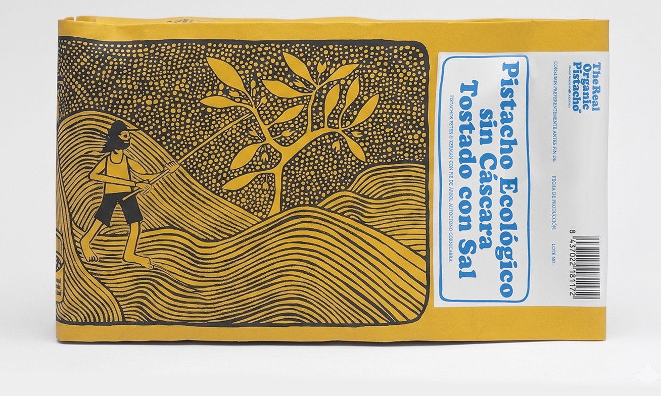
An identity connecting organic cultivation, production and people. Colour and illustration shape a flexible packaging system, while screen printing and carefully selected materials bring a tactile, artisanal quality.

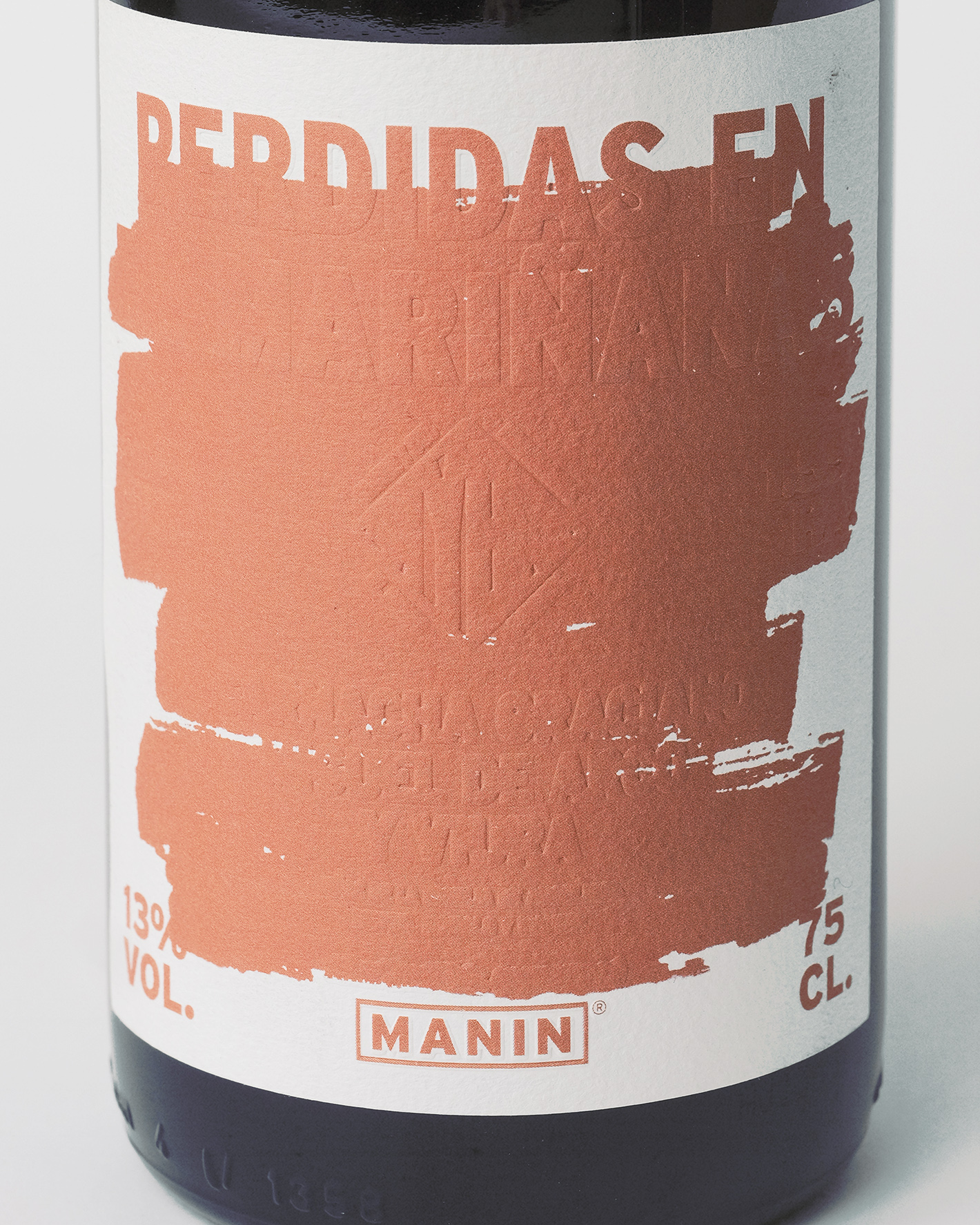
A bottle expressing independent viticulture and resistance. A printed stroke conceals information while blind embossing preserves its trace, questioning the limits imposed on communicating a wine’s origin, terroir and grape varieties.
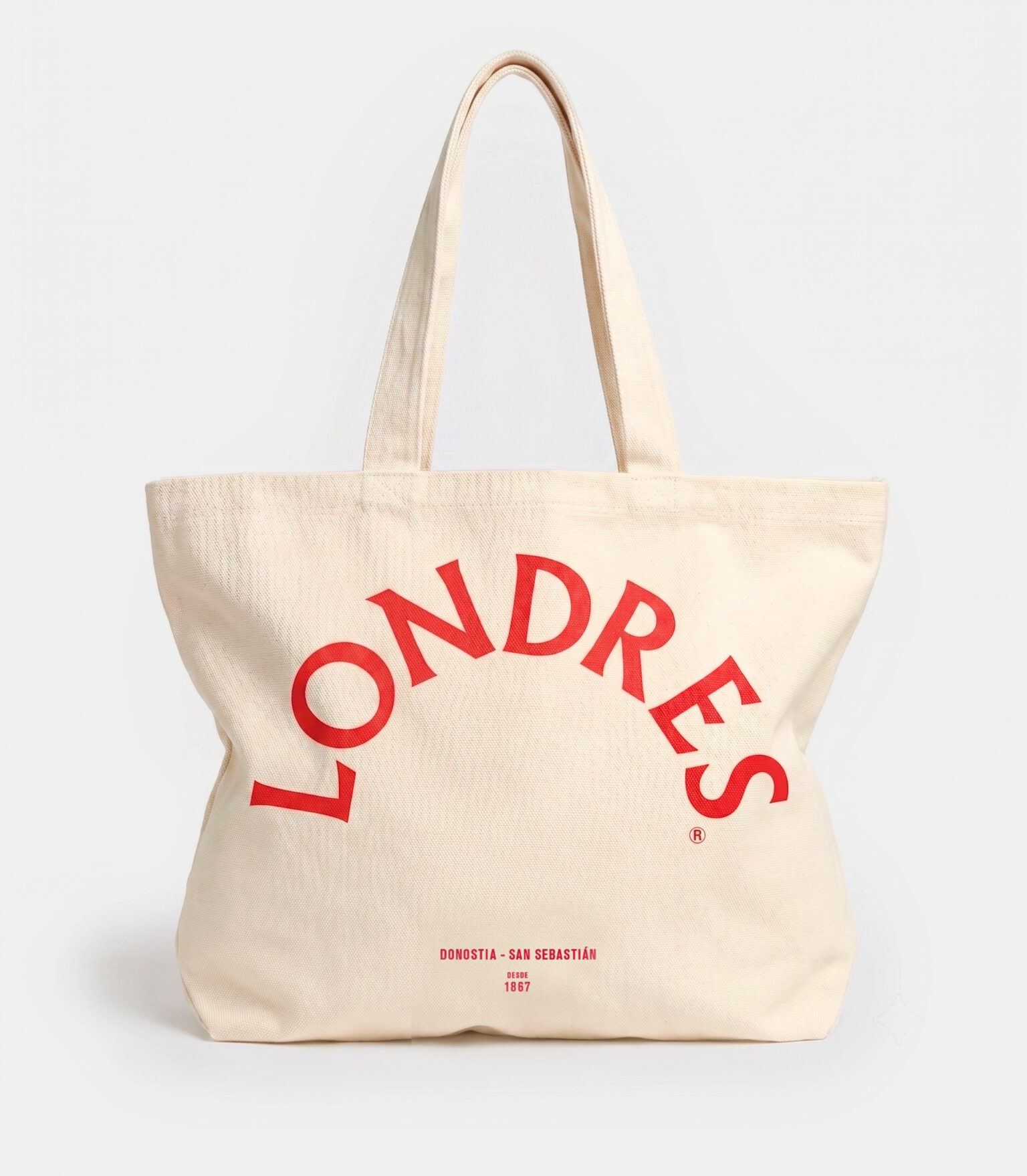
The new identity for Hotel de Londres y de Inglaterra presents a paradox: reinterpreting and breaking its graphic conventions while making everything feel unchanged. Its red lettering is part of San Sebastián’s landscape, iconography and collective memory.