Bienvenido a PENSANDO EN BLANCO LTD. (WIP)
- es
- en


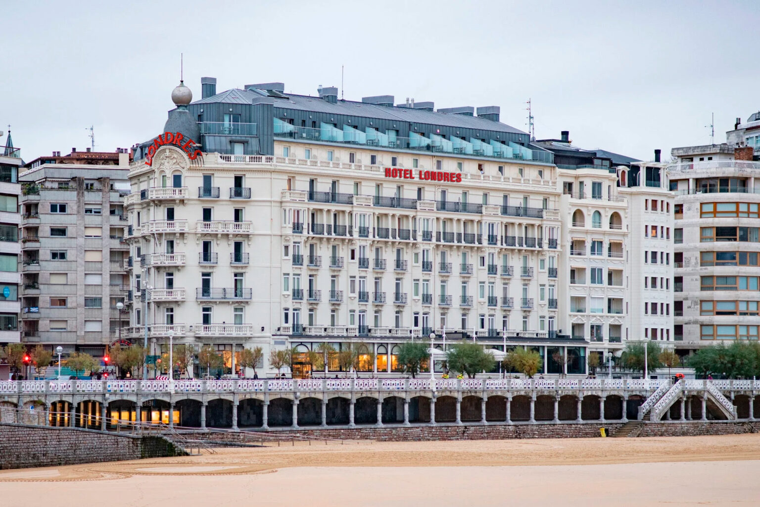
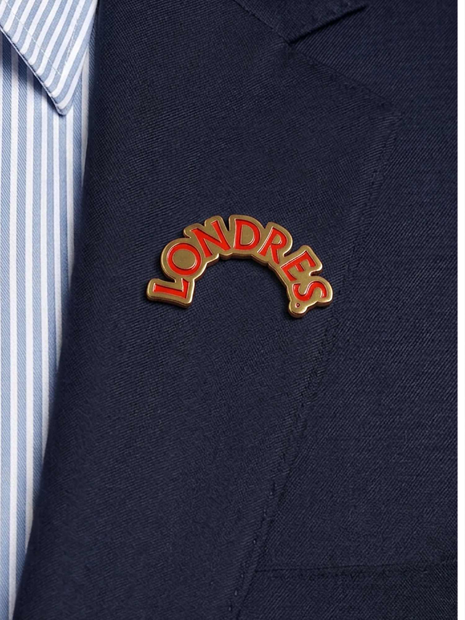
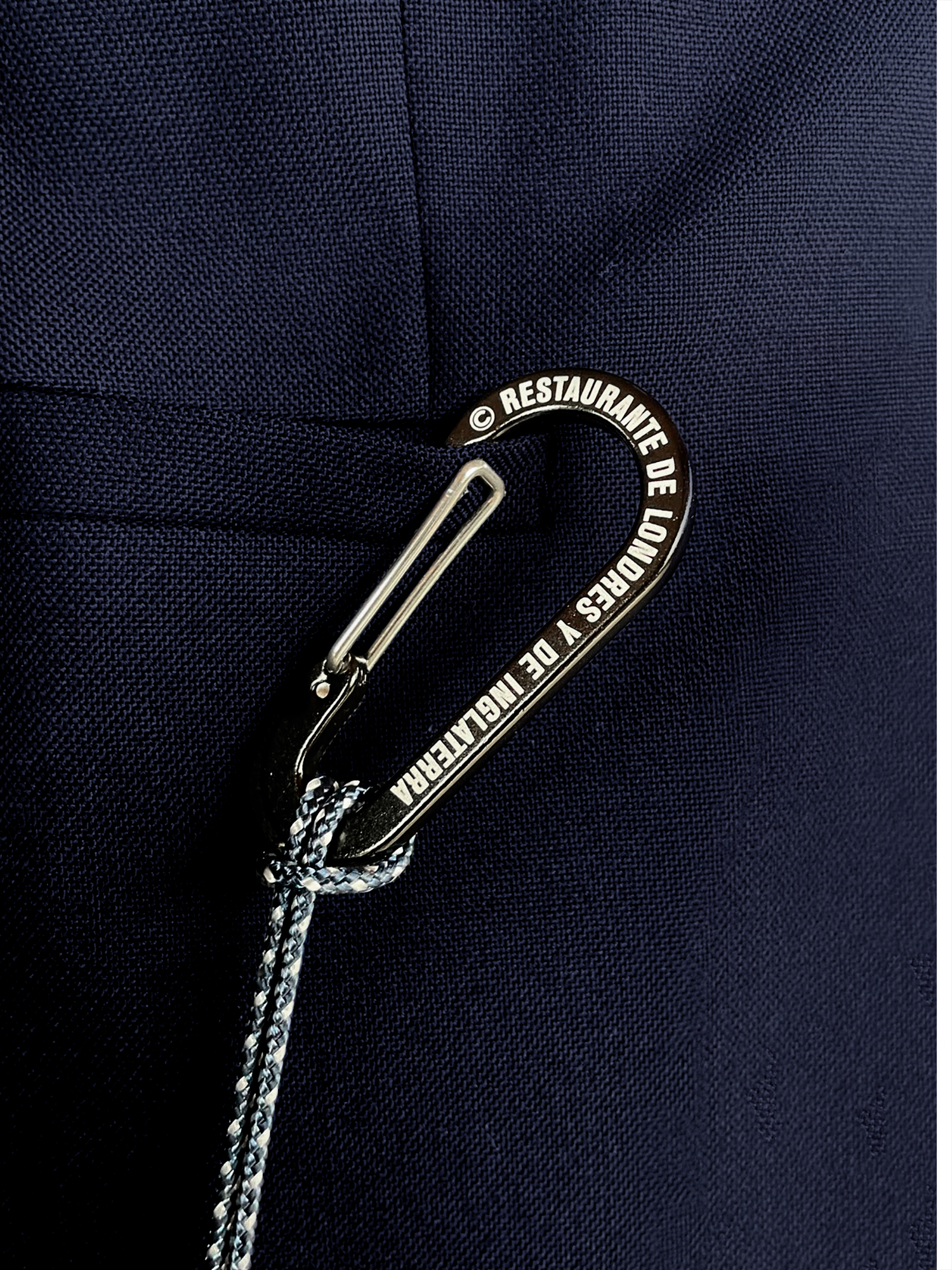
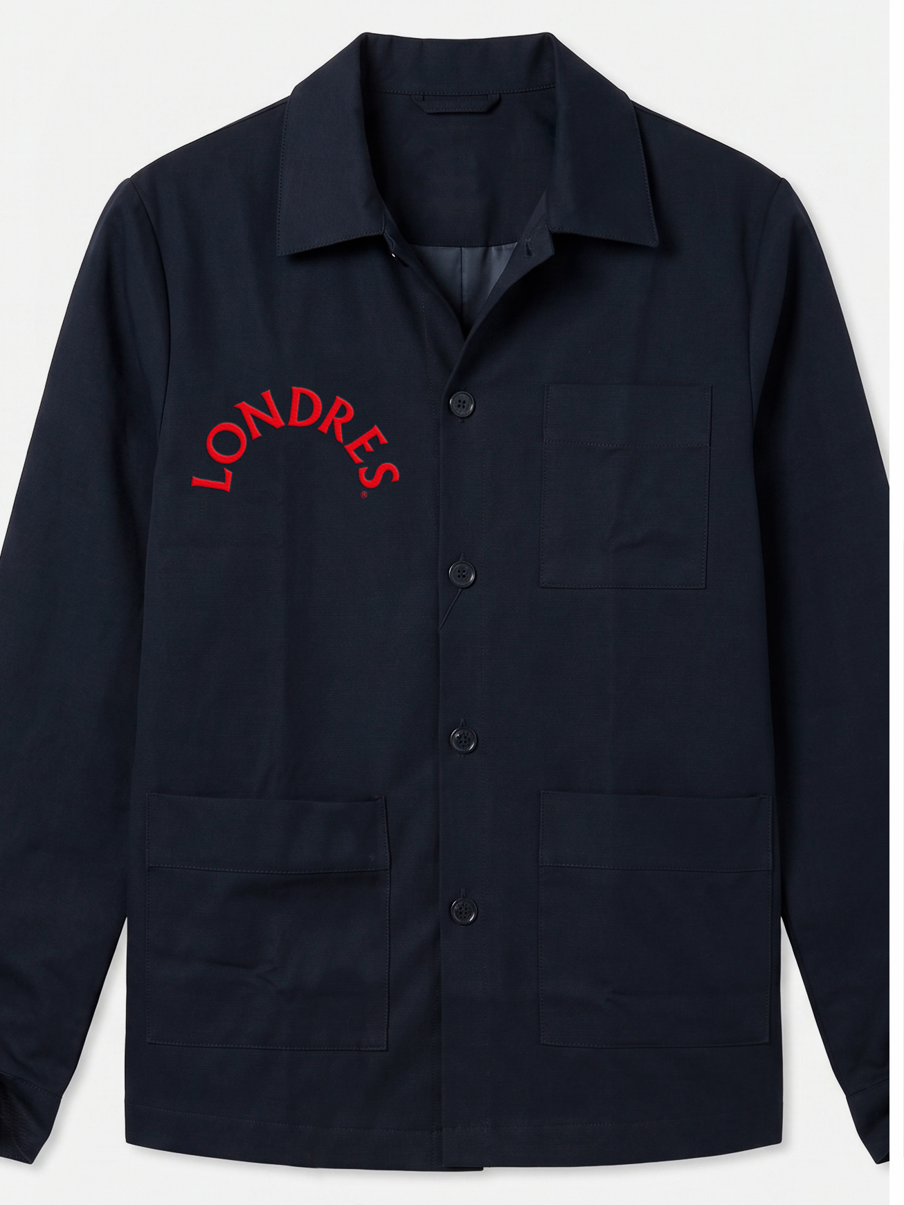
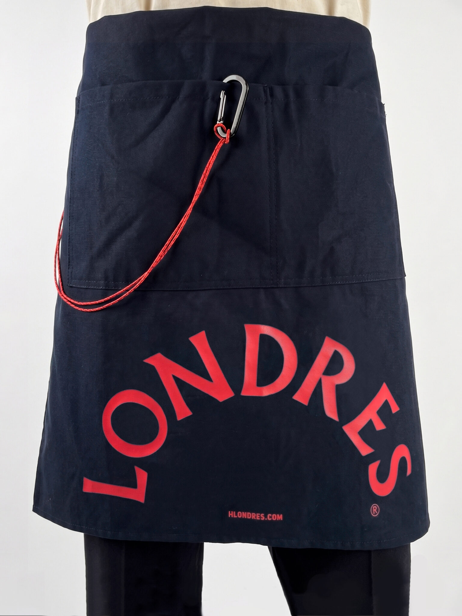
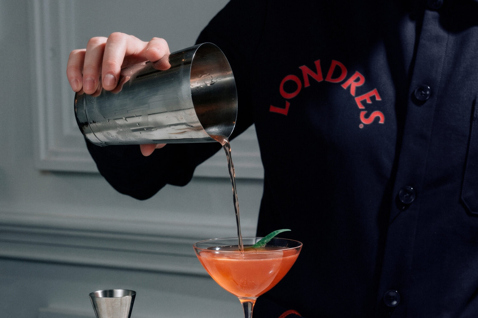
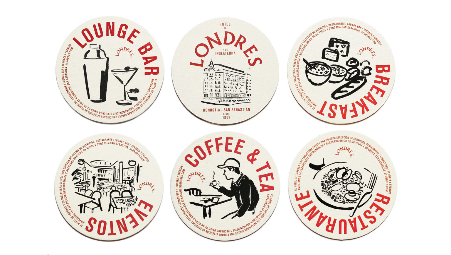
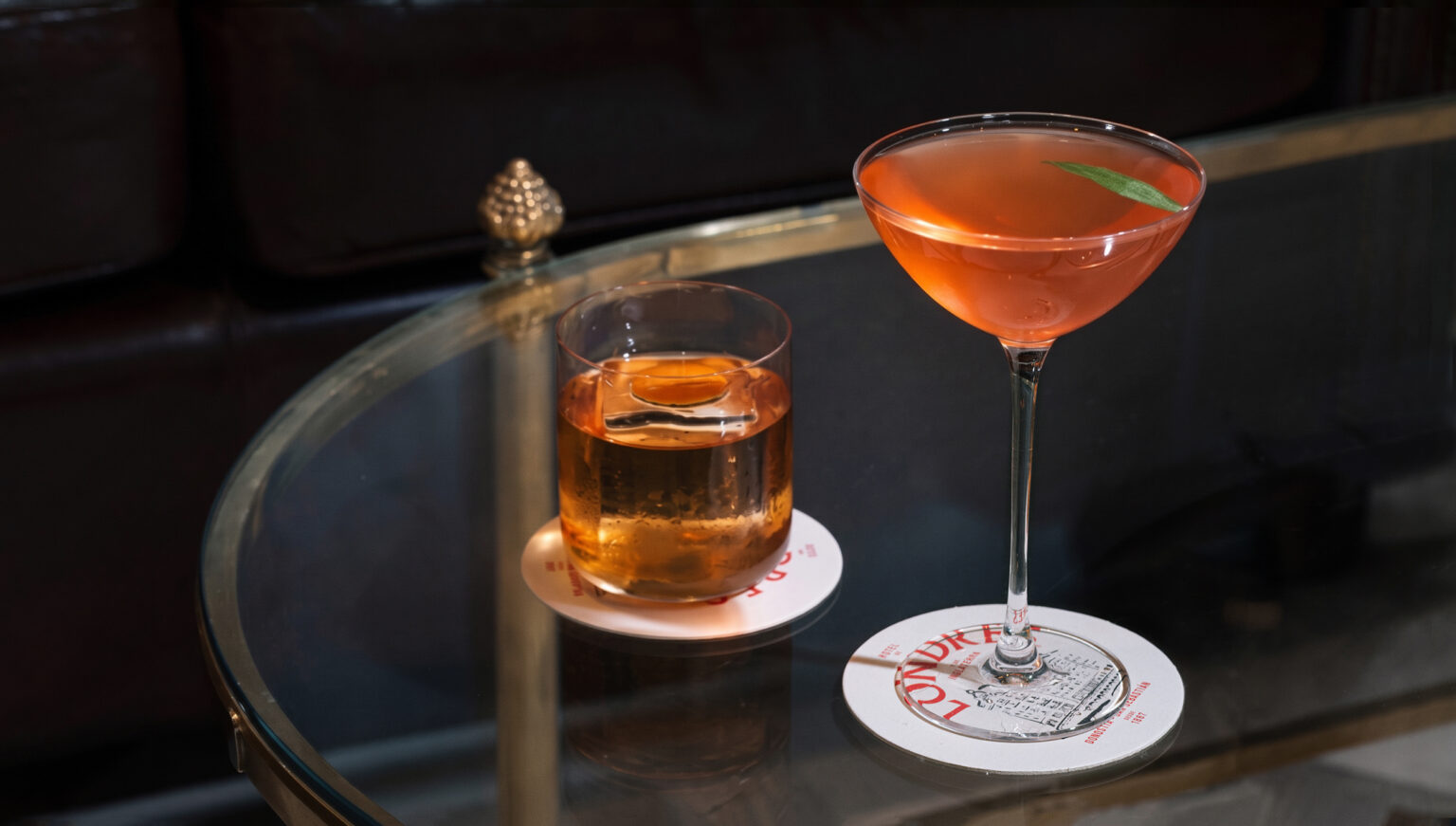
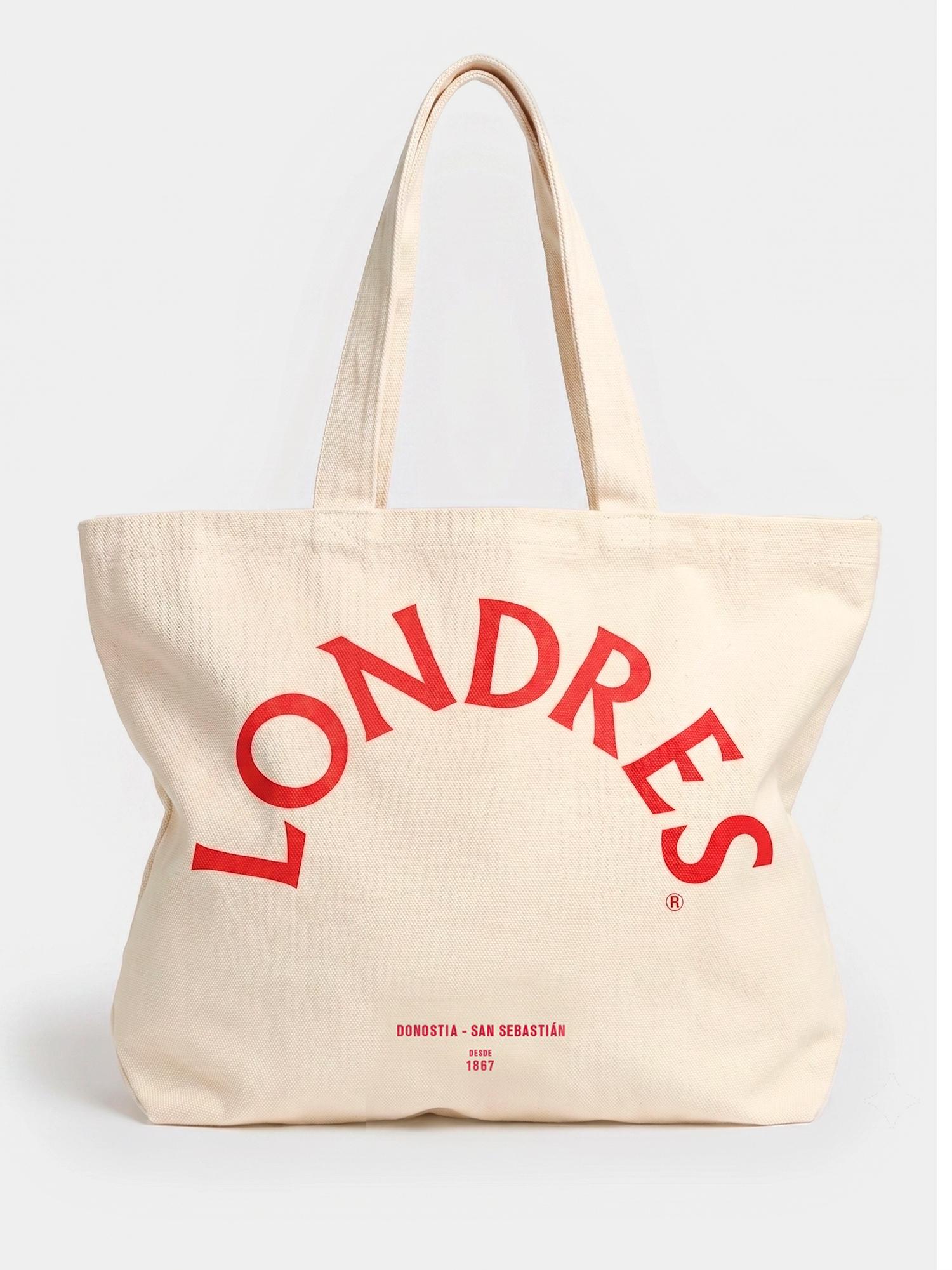
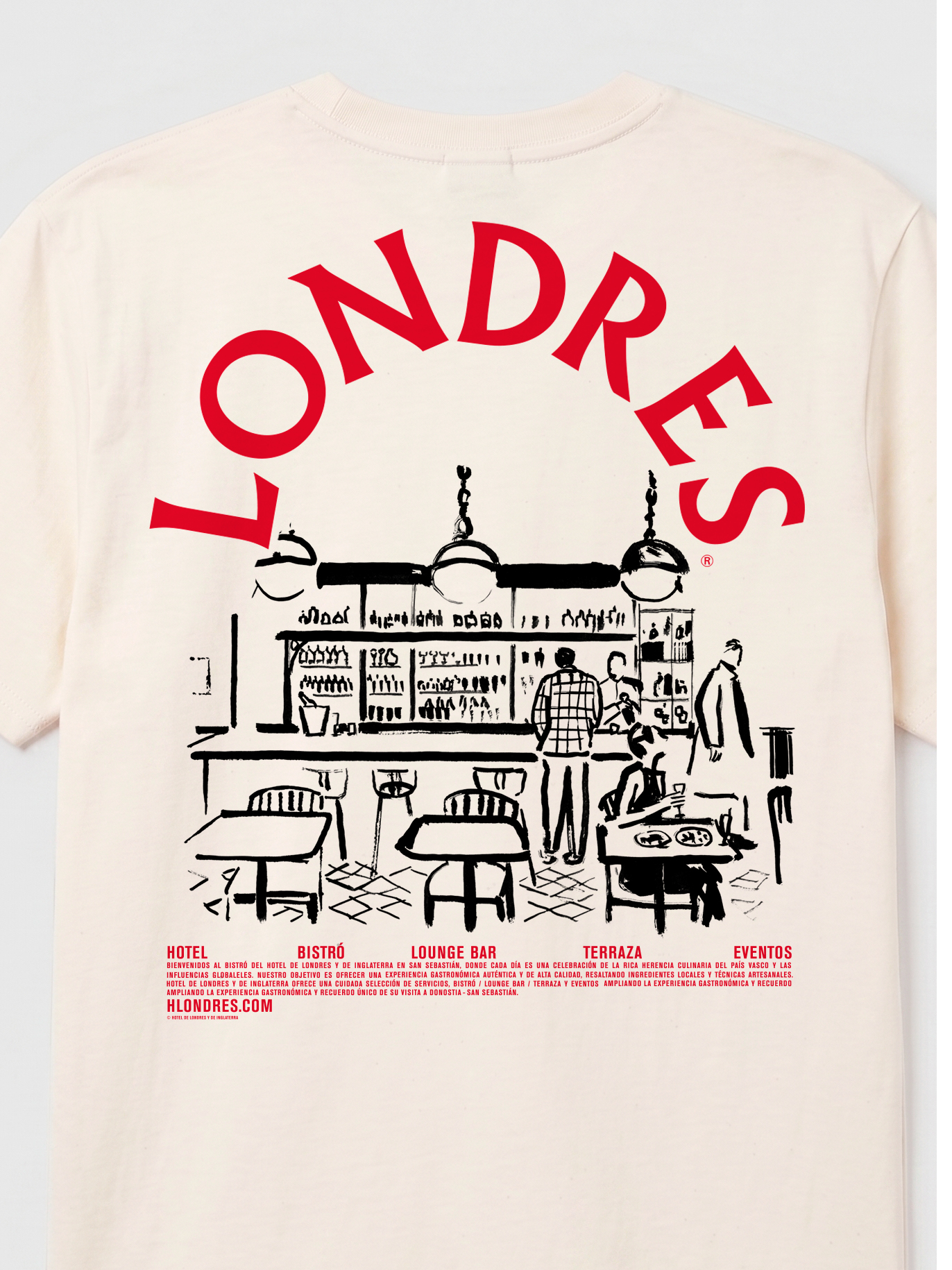
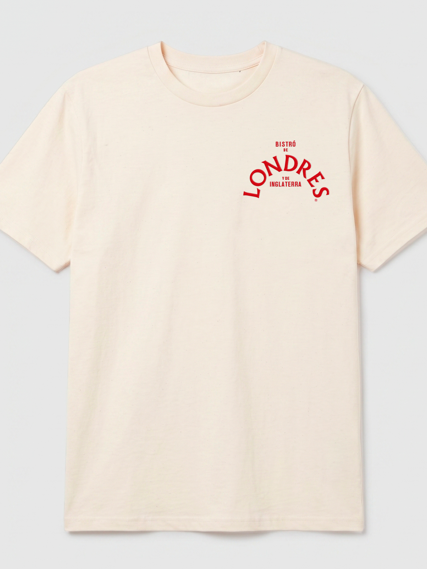
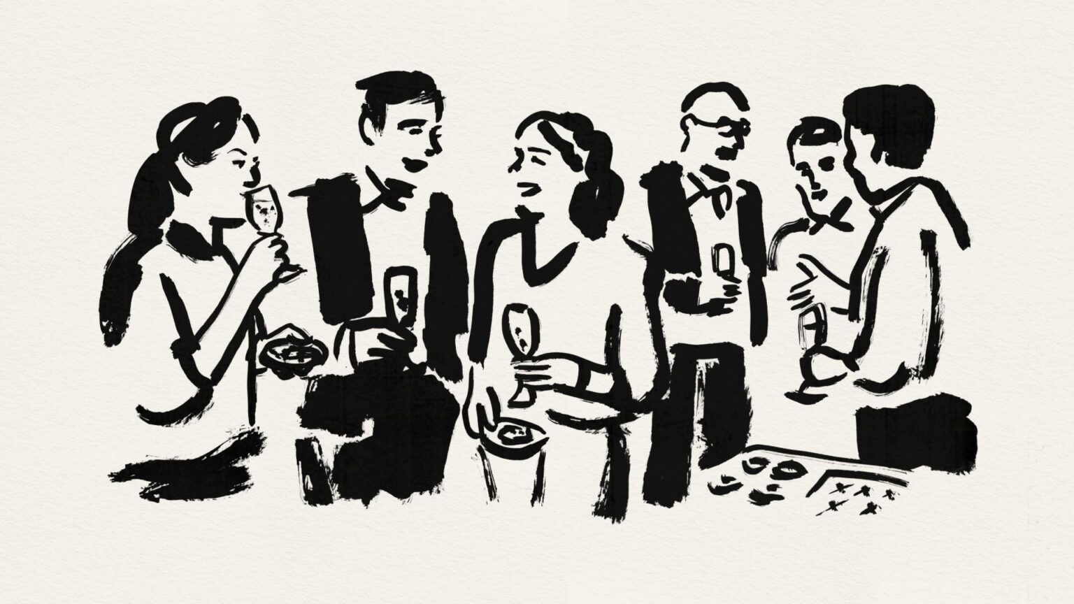
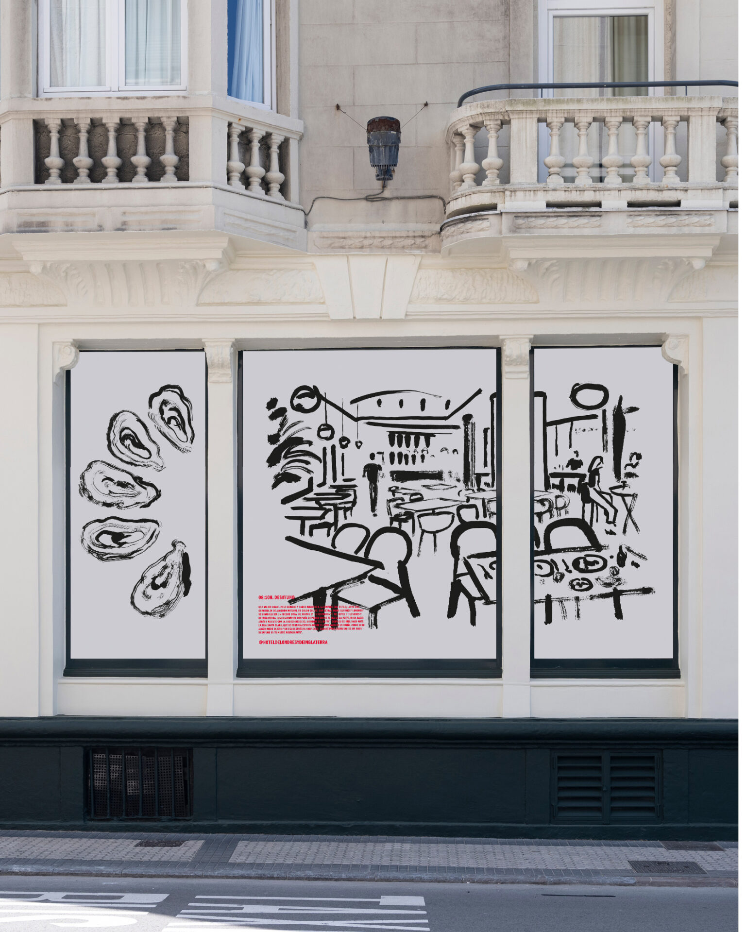
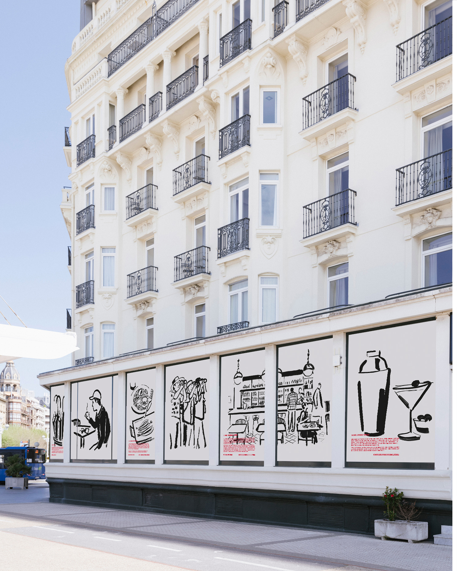
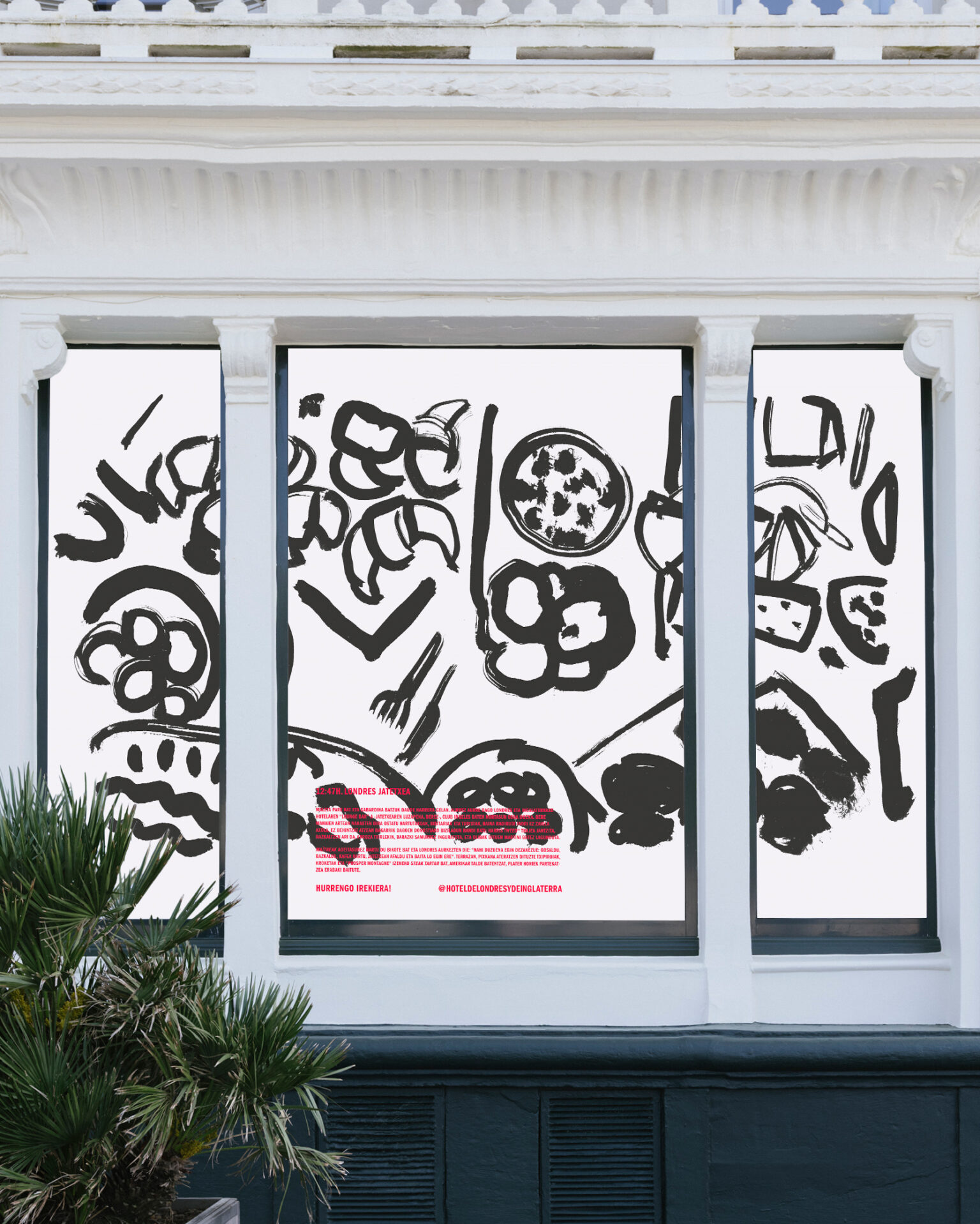
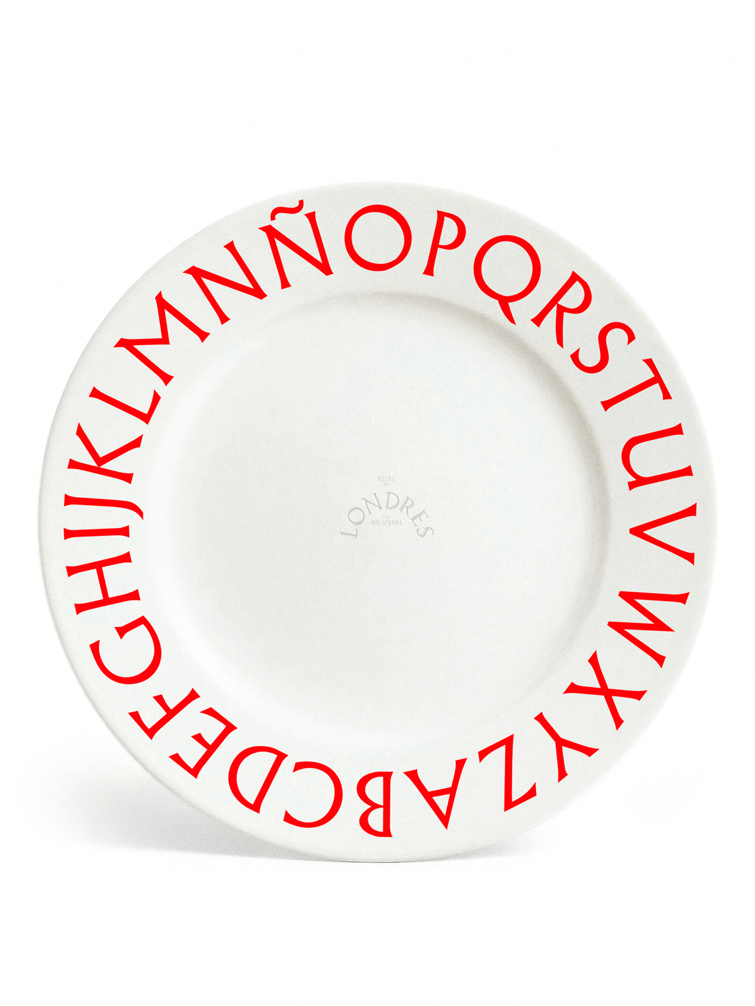
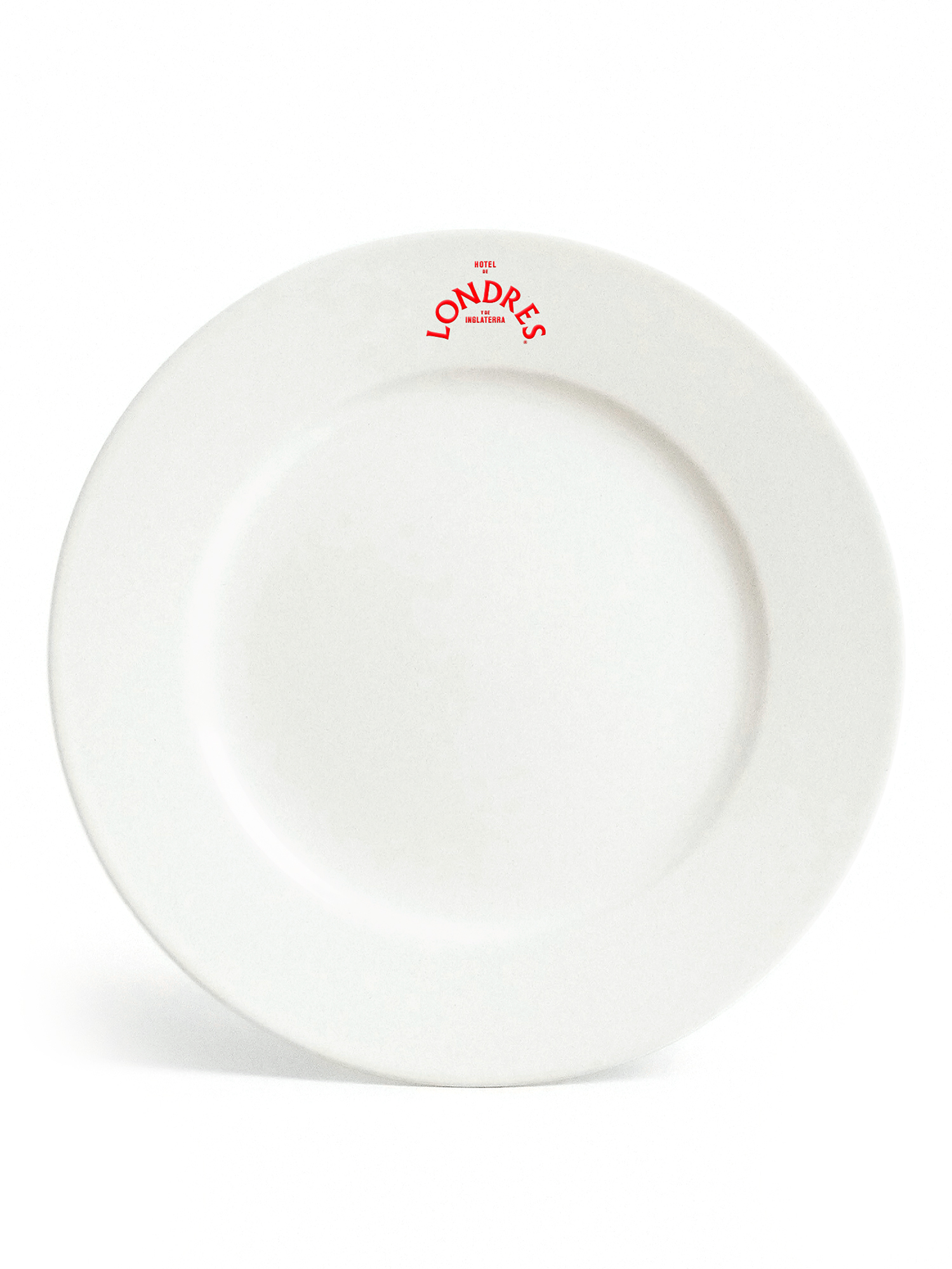
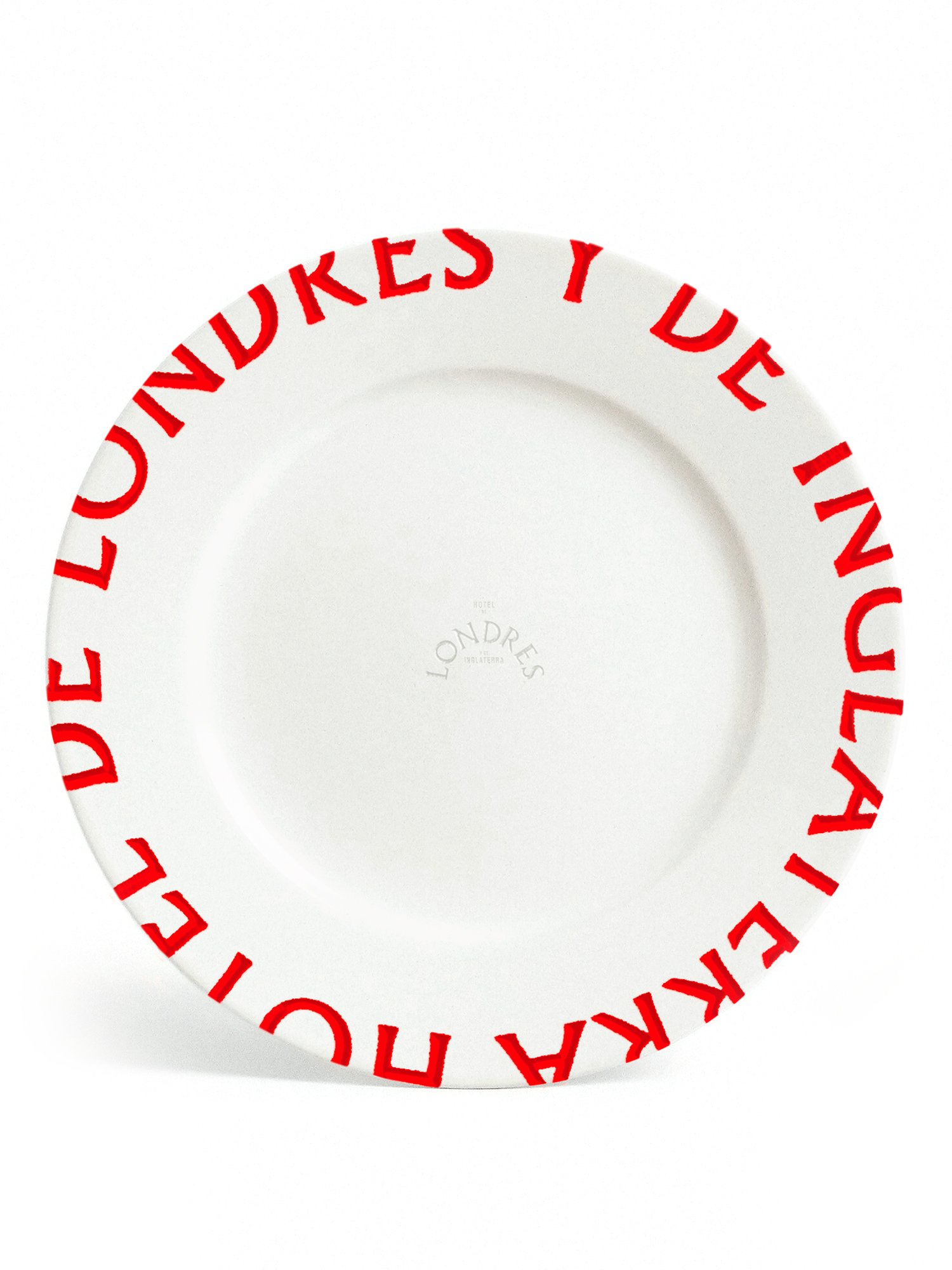
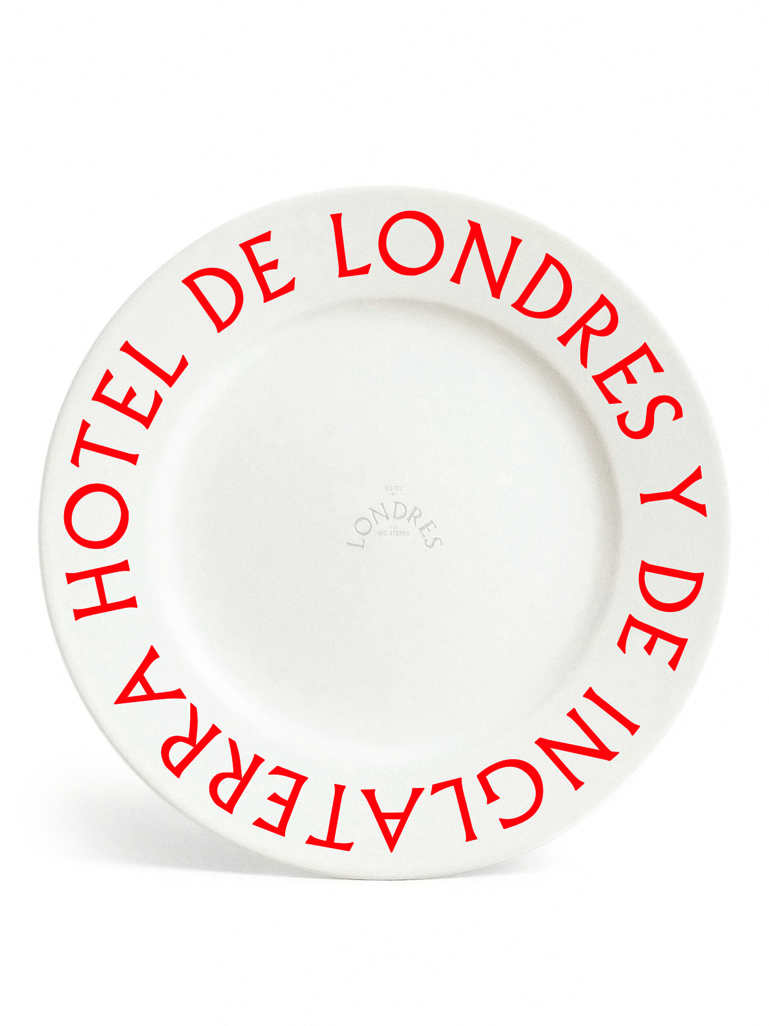
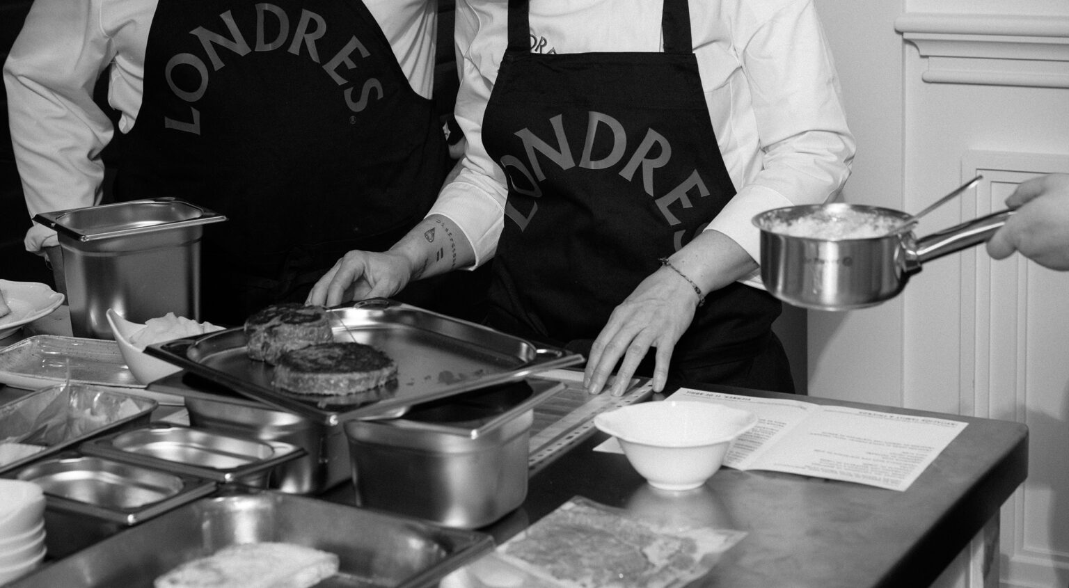
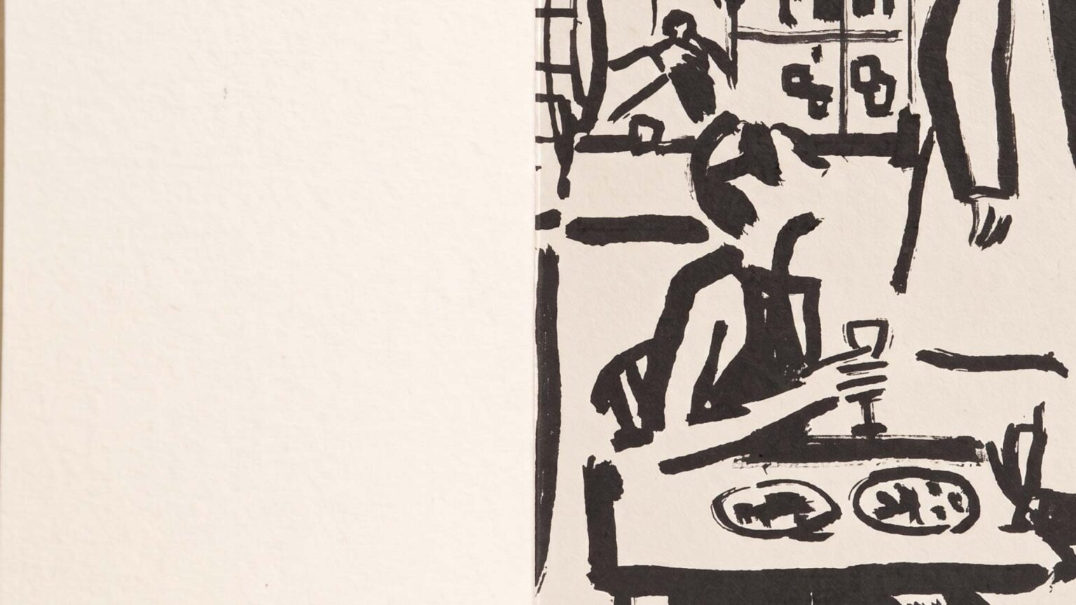
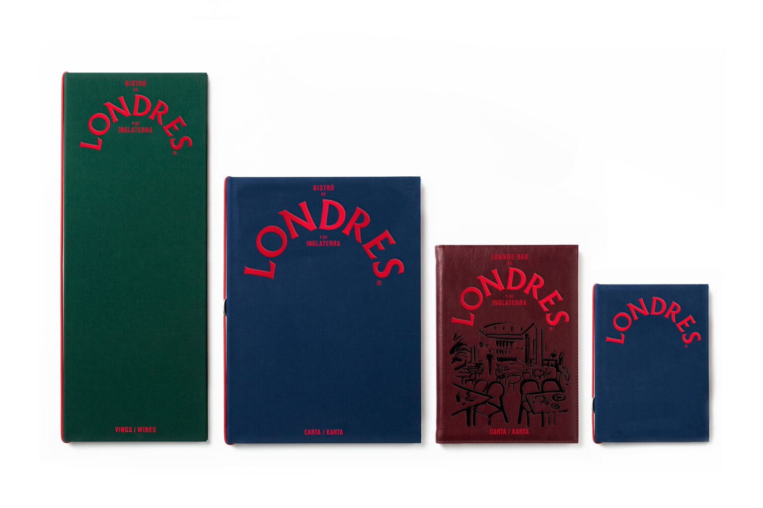
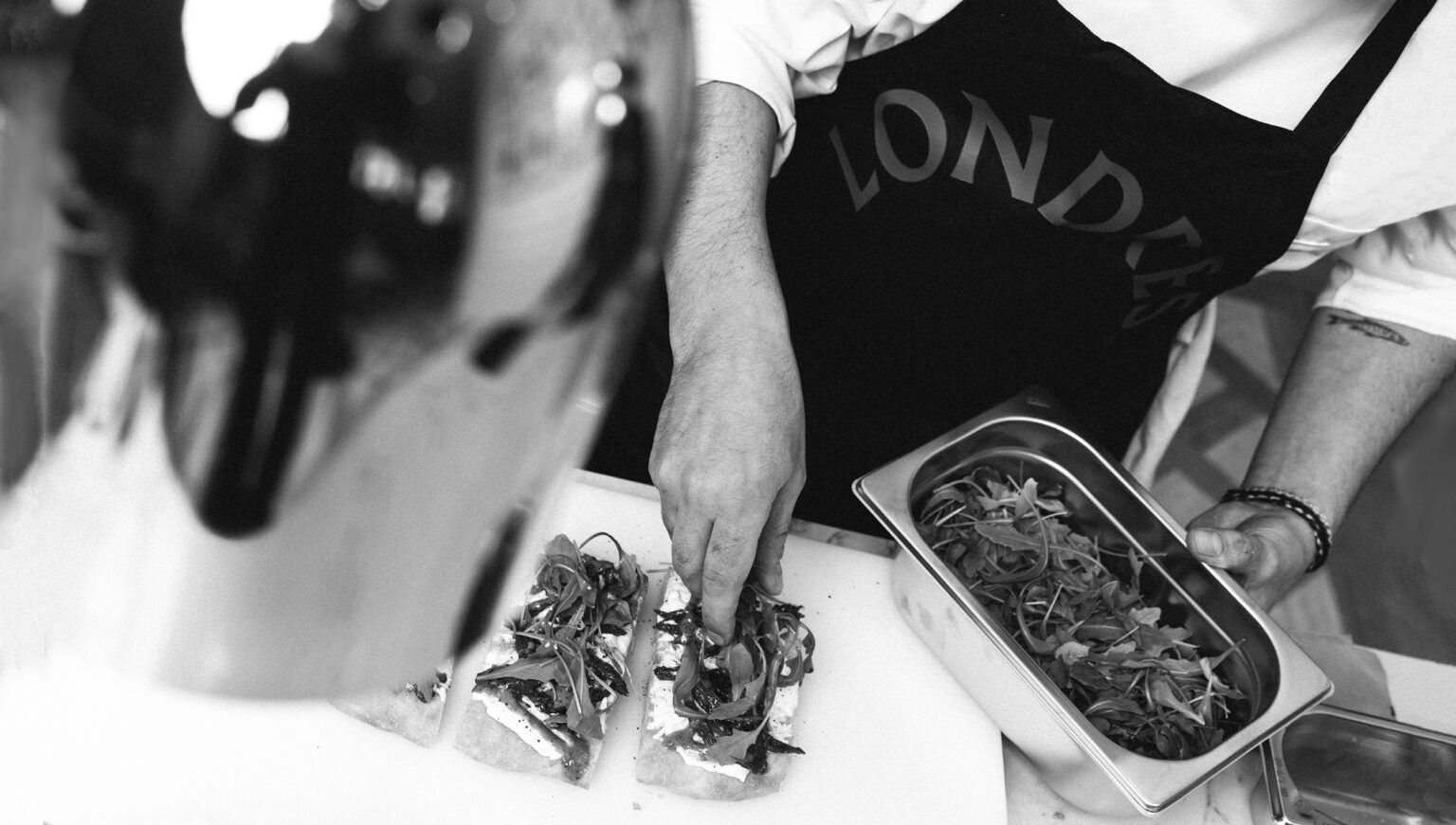
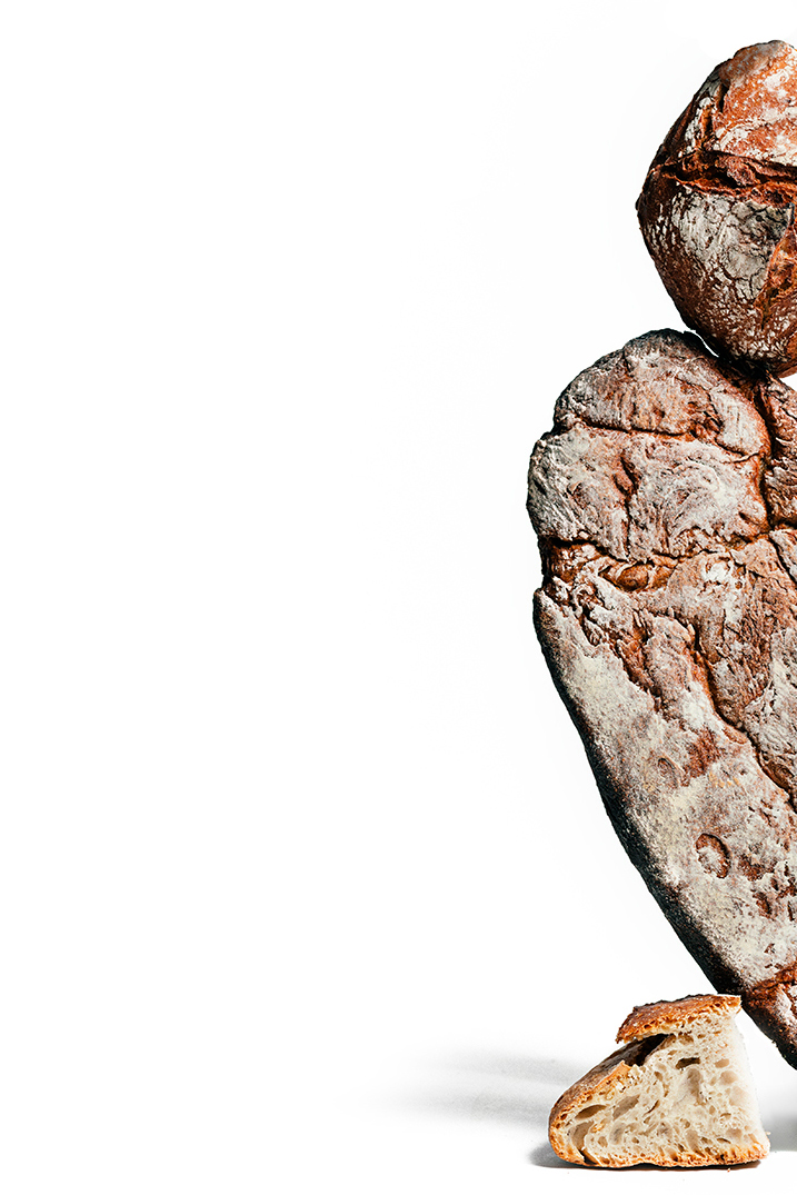
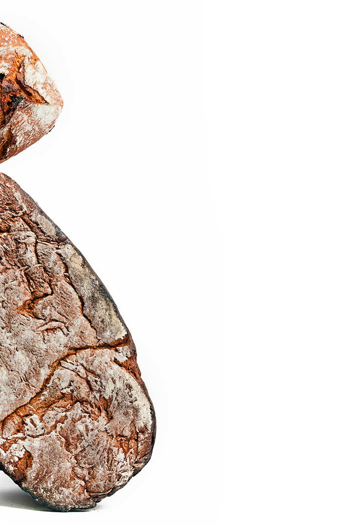
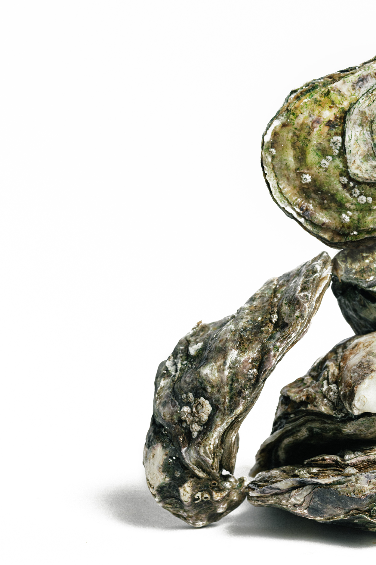
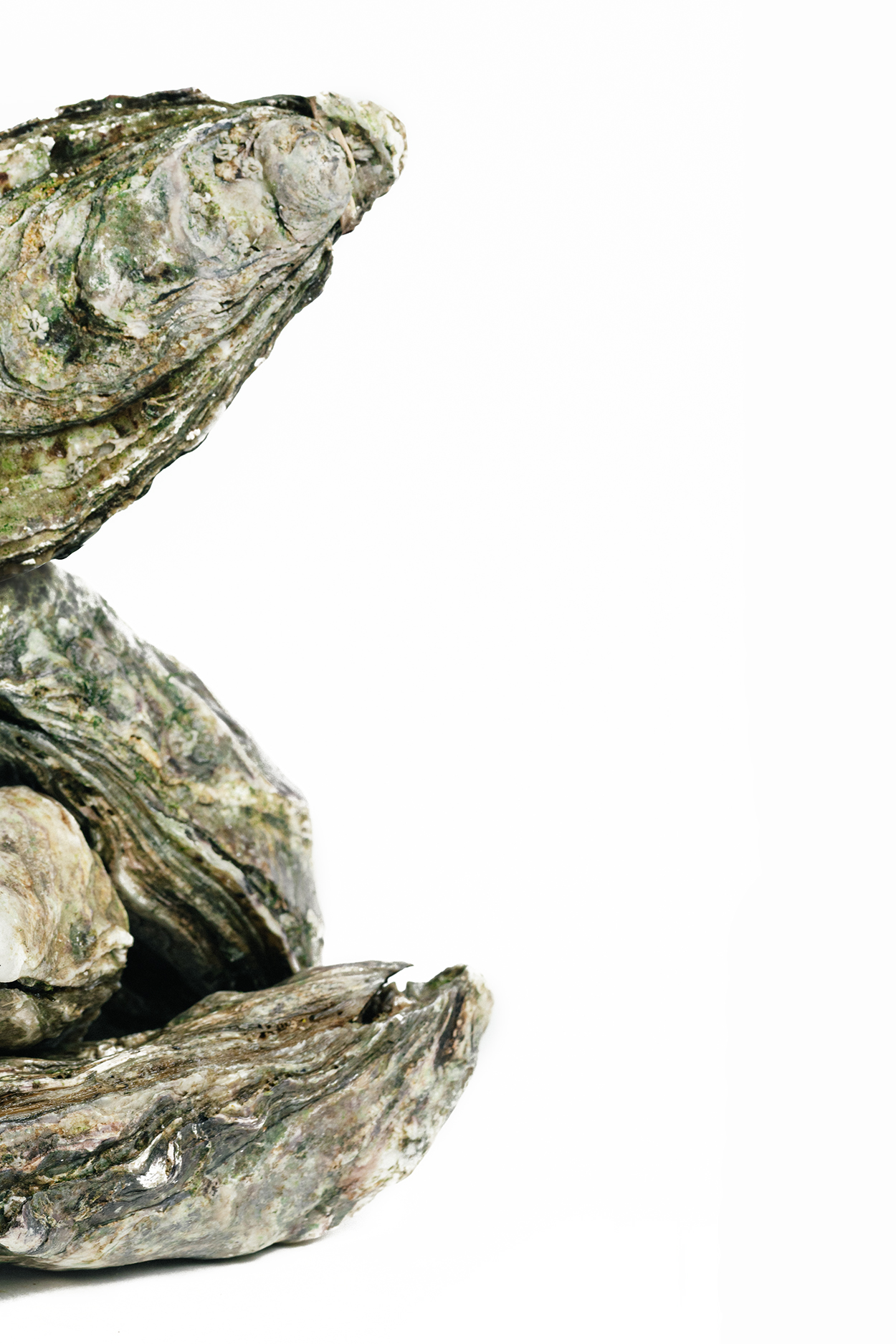
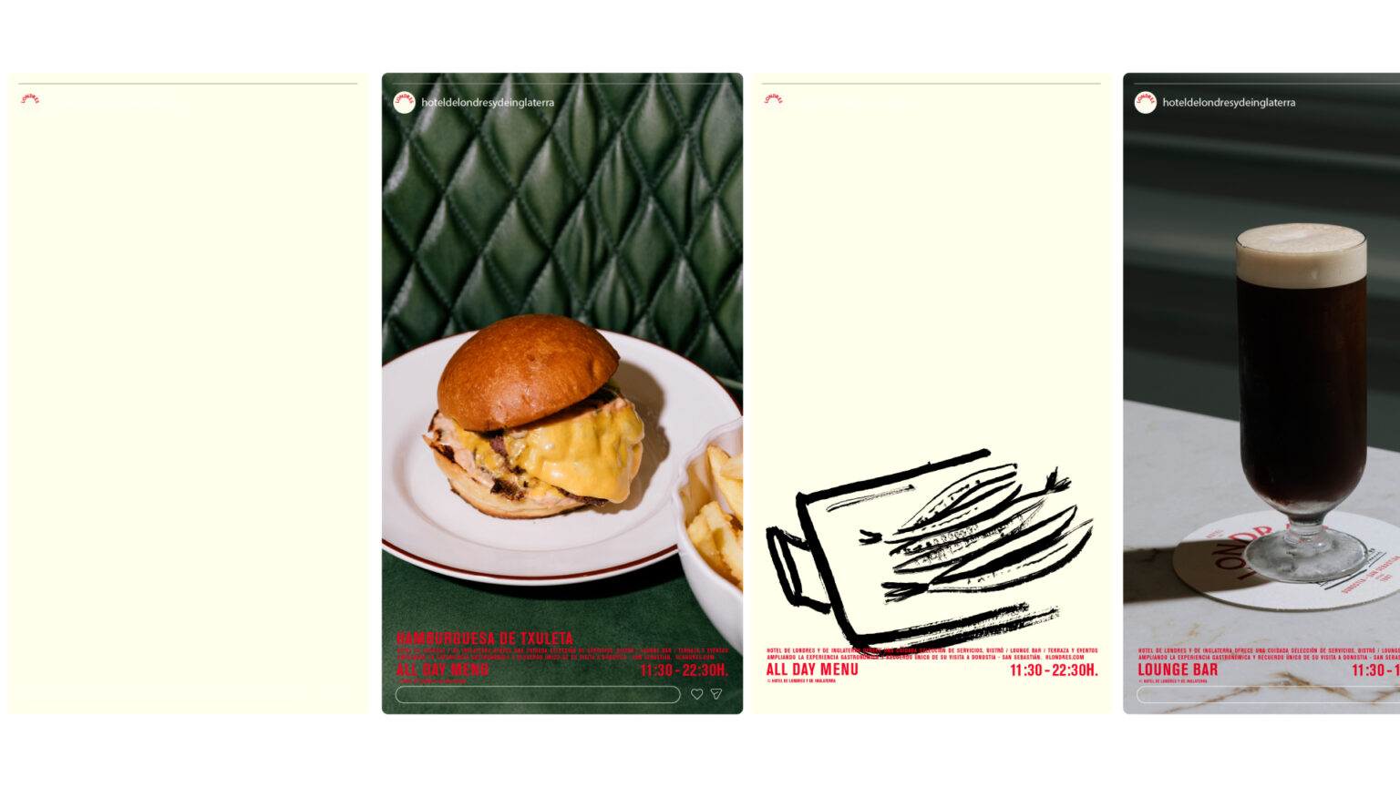
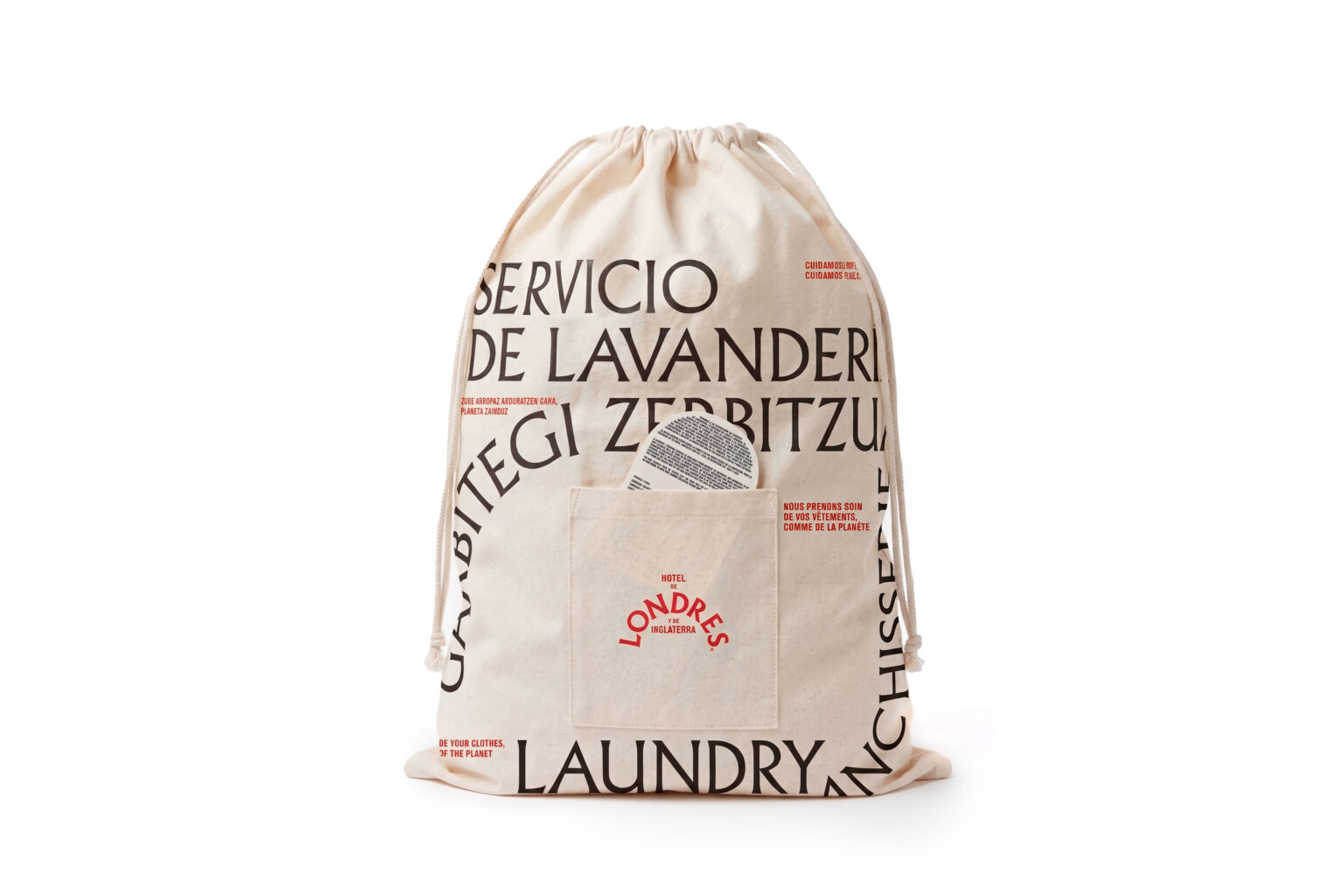
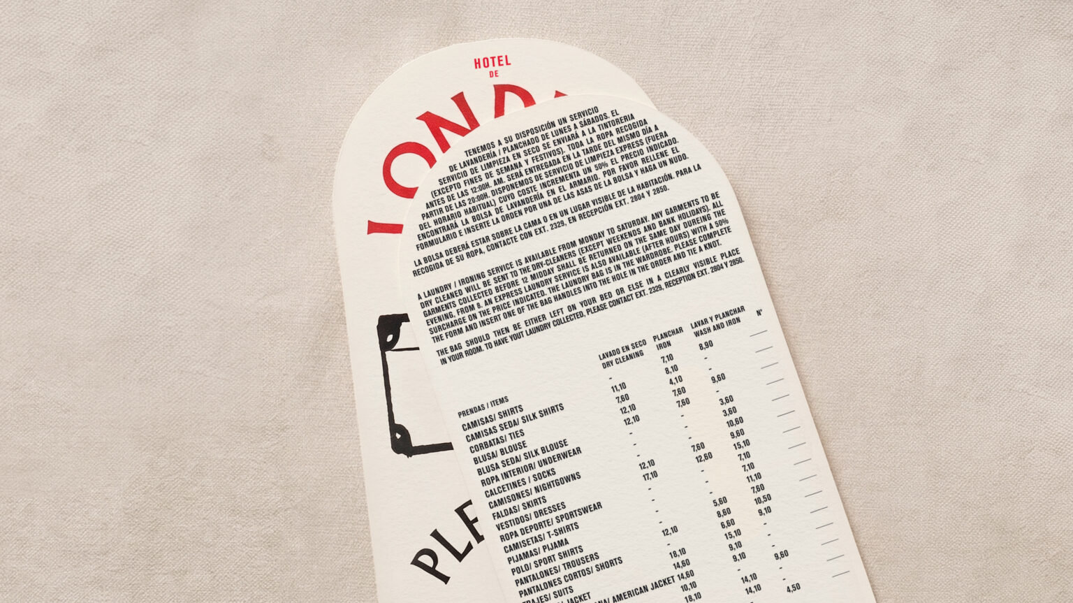
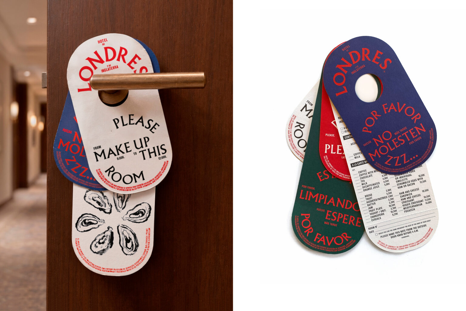
La nueva identidad del Hotel de Londres y de Inglaterra presenta una paradoja: reinterpretar y romper sus convenciones gráficas mientras hace que todo parezca inalterado. Sus letras rojas forman parte del paisaje, la iconografía y la memoria colectiva de San Sebastián. El proyecto preserva esta conexión a través de una tipografía meticulosa, un sistema gráfico evolutivo y una dirección de arte que combina la ilustración y la fotografía para presentar sus espacios y su oferta gastronómica. Un lenguaje visual clásico y contemporáneo a la vez, cuya magia reside en la continuidad: crear una nueva identidad que dé la sensación de haber estado siempre ahí.
La nueva identidad del Hotel de Londres y de Inglaterra presenta una paradoja: reinterpretar y romper sus convenciones gráficas mientras hace que todo parezca inalterado. Sus letras rojas forman parte del paisaje, la iconografía y la memoria colectiva de San Sebastián.
PENSANDO EN BLANCO™ AND PEN BRANDS, DESIGN AND LOGOS
ARE REGISTERED TRADEMARKS OF PENSANDO EN BLANCO LTD.
© 2006 PENSANDO EN BLANCO LTD.
Key: Free International Creative Project
Work: Creative Direction / Interior Architecture / Product
Foundation: © 2006
Founded by: Borja Garmendia / Aurora Polo Santamaria
Reg. Company name: PENSANDO EN BLANCO LTD.
Phone: +34 629 456 762
Adress: Arkolla 70, 20280 Hondarribia (GUI). Spain
Contact: info@pensandoenblanco.com